
At first glance, the map may not look like a data-dependent project. But with Matthew Edney’s guidance, the data of cartography became clear at the inaugural Friday lunch seminar in Information Ecosystems: Creating Data (and Absence) From the Quantitative to the Digital Age.
Edney, the Osher Professor in the History of Geography at the University of Cartography at the University of Southern Maine, does, however, work with data.
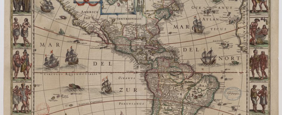
Maps, Edney’s specialty, require a lot of data, as it turns out. And the appearance of the finished map depends on what data is collected, for whom, and why.
As Johanna Drucker has reminded us, the information scholars work with isn’t given as much as taken, hence her alternate term for “data” – “capta.” That concept is clear in Edney’s work, and in the lively discussion that took place during the Sept. 6 seminar, which included Edney and more than twenty Sawyer Seminar participants from the University of Pittsburgh and Carnegie-Mellon University.
Edney’s 1997 book, Mapping an Empire: The Geographical Construction of British India, 1765-1843, argues that the British did not record the geographical boundaries of India so much as they invented the space called India to fulfill their imperial ambitions.
His new book, Cartography: The Ideal and Its History, puts into tension the ideal of a map – that it is a completely accurate, objective representation of geography – with its reality – that it is in fact a representation of Drucker-esque capta, with all the subjective decisions that go along with amassing that capta.
That’s a jarring concept. As an older millennial, I grew up relying on maps before the days of GPS systems or Google Maps, and I was there for the now-strange period when we printed directions from Mapquest to bring on road trips. In my seventh grade social studies class, we learned how to read maps of Montana, my home state, and each of us, with our own state map, worked through tests asking us to locate towns or highways or mountain peaks. If I followed the map (and didn’t run out of gas), I could get from one end of the state to the other. The map was accurate insofar as it would tell me where to go.
The idea that the physical map – and now, the digital kind that help me navigate the serpentine streets of Pittsburgh – does not represent objective reality is a strange thought. Rather, reality is mediated, through data points collected by surveyors or satellites, and communicated through the map.
I spent a lot of time with medieval mappaemundi, like the beautiful Hereford Map, while working on my master’s thesis a few years ago. At first, mappaemundi (Latin for “maps of the world”) are incredibly disorienting: they purport to represent the world, as their name suggests, but they are wildly inaccurate, even if they do show a general outline of Europe, northern Africa, and western Asia. But once I realized that literal accuracy wasn’t the point, it became clear that the maps were instruments to communicate religious, cosmological, and moral values in complex ways.
Listening to Edney discuss his work, I realized that modern maps aren’t so different. I kept thinking back to Mapping an Empire, in which Edney links Britain’s imperial nation-building and desire to wield power in India to their impulse to map the subcontinent. Like mappaemundi, those early maps of India expressed moral values – that colonialism was justified, that careful and rational measurement could make possible the mapping of the massive Indian subcontinent, and that the (supposed) superiority of one group of people over another could be demonstrated by such an endeavor.
Much of the conversation on Friday did not deal with imperialism, but rather with another hegemonic power – this an economic one. Google’s efforts at mapping is in itself an exercise in collecting, curating, and combining massive amounts of data, Edney noted. Getting those disparate datasets to go together is a problem for Google, as it’s been for mapmakers. Even points that seek to represent reality, as it turns out, don’t match up.
Google’s ability to take street-level photos has sparked privacy concerns, an issue that came up in Friday’s seminar. Cars with blurred-out license plates and people with blurred-out faces remind us that Google collects data on the fly, not bothering to stop and ask for permission. While a recent Associated Press investigation found Google surreptitiously collects location data through the Maps app, Google has been in situations like this before. The company recently settled a class-action lawsuit alleging it violated federal wiretapping laws while gathering data for Street View. Google seems to be a bit cavalier about the personal privacy of you and me, but try to use Street View in Area 51 and see what happens.
Where does this get us, especially in relation to the seminar’s goal of understanding information ecosystems? For me, it’s about understanding the way data is both helpful in understanding the lay of the land (literally and metaphorically) of any project, and how it might hinder us. Data is a good thing, and the more we can get (assuming it’s good), the better chance we have of understanding our problem. But data isn’t a stand-in for an answer; it does not guarantee understanding. Surveying information did not provide the British with any better understanding of the people of India, or their culture, or their history. In some ways, then, the promise of piles of data can be tempting in the same way an all-you-can-eat breakfast buffet is tempting, but it doesn’t offer anything in itself, and its overabundance might lead to a headache or heartburn.
Briana Wipf is a PhD student in the English Department at the University of Pittsburgh. She studies medieval literature and digital humanities and thinks the Hereford Map is one of the coolest things ever. Follow her on Twitter @Briana_Wipf.